When working with web based systems where there are multiple instances of the same product, such as development, test and production environments, its often desirable to be able to apply a colour scheme to an instance to distinguish each apart. This isn’t dissimilar to potentially applying different Windows colour schemes to different Windows servers, or to a terminal or SSH client connecting to different endpoints. In some cases a web app will allow you to natively do this via some customisation of say the header, or by applying an entire themes, but where that’s not available Dark Reader is a browser add-on that can help.
As the name implies, Dark Reader is typically used to make light pages dark. Many people find reading on a dark background more comfortable, but many websites today have a single colour theme and do not implement a dark mode (it’s on my todo, but not today).
Dark Reader has a default set of rules that can be applied to darken a page, and this works very well if you just want to force pages into dark mode. However, there is also the option to apply custom CSS on a per site basis which allows for very fine tuned control of the customisations applied to a page. Given the CSS is user defined there’s no requirement to make the page dark. You can, if you want, just use CSS to change elements colours.
The user interface for Dark Reader can be a bit fiddly, but if you’d like to use it to customise the CSS of any page you can do so by following these steps.
- Download and install Dark Reader. It is available for free on the Google Chrome, Microsoft Edge, Firefox or as an (unfortunately) paid Safari extension. Other Chromium based browsers, Brave etc, can use the Google Chrome link generally.
- Navigate to the site to theme.
- If you do not want to make all sites dark by default, in the extension on the Sites list tab, select Invert listed only and then add the URL for your site to the list.
- In Dark Reader, under the More menu ensure “only for www.your-site.com” is selected. Then press the Static button for Theme generation mode. A little orangish pen icon will appear on the upper right of the button. Click this.
- A CSS Editor will open. Ensure your webpage adders is listed at the top and not “All Wbsites”. If all websites is displayed, revisit option 4.
- Enter your CSS for the page. You’ll need to come up with this for yourself, although there may be some online sources with alternative CSS for popular sites. Check the current sites source code in your browser to help you identify CSS to customise.
- Click Apply to preview your changes.
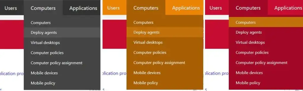
As an example, here’s some CSS and examples of the changes you can produce.
CSS/* Main Toolbar Colour */ #main-menu, #main-menu .menu-header.has-submenu, #main-menu .mega-menu-img-menu-link { background: #eb8405; } /* Dropdown Menu Pane Background Colour */ #main-menu ul, #main-menu .menu-help-short, #main-menu .mega-menu-img-menu-link.highlighted, #main-menu .menu-header.has-submenu.highlighted, #main-menu .menu-help .submenu-no-hover, #main-menu a:hover { background: #a85f03 !important; } /* Dropdown Menu, Hover Over Entry Background Colour */ #main-menu ul a:hover { background: #c2700a !important; } /* Dropdown menu bolded title colour */ #main-menu .mega-menu-title { color: #f2a83f !important; } /* Dropdown menu seperator line colour */ #main-menu .menu-sep { background: #f2a83f !important; }
Original/Production (left), Pre-production (middle) and Test (right) Lastly, it’s worth noting there are other extensions out there that can do this. Dark Reader is one worth looking at however as it’s open source which can be verified to be handling your browsing data in a secure way. For an extension can that access and modify a page, this is always a consideration that should be front of mind.
I obtained a GameSir G8 Galileo recently and was unsure how the device would fare with an iPhone 15 Pro Max in a Bullstrap leather case. GameSir doesn’t specifically advertise case support and I was unable to find information on this configuration. I was prepared to need to take a knife to the GameSir to cut down the rubber patting in order to get a decent USB connection, which some users have had to do with certain cases. It turns out the GameSir G8 works amazingly well paired with the iPhone 15 Pro Max and this leather case and no hacking of the controller was necessary. That’s in part attributed to the open base of the case (which some dislike but I don’t mind) as well as the flexible USB port on the G8.
USB Connectivity between the G8 and an iPhone 15 As a point of comparison the Backbone One 2nd Generation also works well with this phone and case. No problems there either.
Comparing those two devices, the Backbone is much smaller, sleeker and portable, but can be a bit cramped in some titles. The Games on the other hand is massive, similar grip size to an Xbox controller, but is more comfortable to hold. In terms of portability Backblaze has an official case where I haven’t seen a great fitting option yet for the G8.
The one other difference in the G8’s favour is the Backbone has issues with the iOS version of Inside. Horizontal movement works but the jump button and other actions do not. GameSir (and PS5) controllers work fine. As an indication that this may be a bug with the game, if you launch it with a GameSir attached then disconnect the GameSir and insert the phone into the Backbone, the Backbone works then on until Inside is restarted. Odd. I hope the developers fix the title (support ays they’re investigating the issue). Unsure if this issue with the Backbone will crop up in other games or not and hopefully it’s limited to the one release. Even Limbo by the same developer is fine.
Otherwise both are good options for iPhone 15 gaming. I think the devices will become a lot more valuable now we’re seeing titles like Resident Evil 5 and Village coming natively to iPhones. On screen controls just won’t cut it for many titles moving forward.
This article is going to go over the first things I’ll do when logging into a Debian server for the first time. For me, this will be a VPS that has been deployed by a web host, almost always with the latest Debian release. The first things I want to do are update and secure it. Much of should apply to other Linux Distributions.
(Continue reading…)With the recent changes I’ve made to the site and in particular the goal of making the site more responsive, I’ve gone back and looked at how I display text. Until now I’ve gone by what looked good to my eye, with no real consideration for established accessibility guidelines. This led to the previous setup where I had a ‘hero container’ of 1100px with a default font size that by default would be around 16px. It’s largely been something I got away with ignoring as I wasn’t concerned about mobile experience, but as soon as that became a concern, I discovered my current font setup was not scaling well to mobile.
Turns out that best practices for prioritisation of readability is to have lines of text that are roughly 45 to 75 characters long. This is noted time and time again on the web as something to aim for, and the more I see examples of the more I agreed there may be some merit to that guideline. The layout I used previously far exceeded this and was running at lines of around 120 characters per a line. It wasn’t horrendous as the page was clean, but other sites were easier to follow. To try and get closer to this target I’ve made the following changes:
- Reduced the site hero container to 900px.
- Increased the padding between the main container and text, effectively making the text region around 800px.
These two actions decreased the amount of horizontal space for text. As I have no plans for vertical navigation, multiple columns or lots of graphics, it was necessary to drastically reduce the canvas width. So far, I think it looks fine and the extra white space frames the text well. Even with these changes lines were running long, so I additionally:
- Increased the desktop font size.
Right now, I have fonts set on desktop to the equivalent of 20px. The blog is largely just written content so having larger more present text allows that to take centre stage and makes the articles in turn very readable (in my opinion). A blog post, 4 Reasons I Use Large Type by Mike Anderson, lead me down that path and I think it has worked well for me.
After making those changes, I found that when I flipped to mobile that text was now much too large. To fix that I’ve decreased the root font size that all text scales against on mobile is 80% of what is used on desktop. I also drastically reduce the page borders on mobile.
The net result of the is that currently on desktop lines are around 80 characters while on mobile it’s around 55. I’m happy with the result.
Counterintuitively, and probably to my detriment, I haven’t settled on a font yet. Depending on whether I change that then I may be forced to experiment with the above numbers some more, although the targets will remain the same.
Something to note is that I’m also using scalable font sizes where previously these were fixed. This was important to allow people to scale text if they so desire. While above I noted 16px and 20px as the target output, this assumes a default text zoom at the browser. Actual fonts are being rendered using rem versus px, which makes the sizing relative to a base sizing to improve scalability. The text should scale gracefully for people with non-standard text settings.
Lastly, another useful tool for web development and font layout is this golden ratio tool. Recommend using this as a starting point as it helps to inform vertical spacing and other layout elements that I’ve begun to consider and also contribute to the presentation of text.
New website content is coming along. I’ll be updating this post as I go to list changes, as well as where my priorities are. As it stands, I’m largely making this up as I go and haven’t gone in with any sort of prototype, so there might be some back and forth on design and some pages will be broken for a bit.
Priorities
- Fast (Performance)
Looking to massively improve site performance with a lighter design and better server setup (more considered caching and optimisations). Pretty much there already but will strive to not let that slide. Ohh, and I’ve moved the site to a much faster VPS instance. All in all the previous homepage was very graphic heavy and slow to load, and I’m looking to get away from that. - Good page benchmark in general
Along with the actual speed, I’m looking to ensure accessibility and other factors that Google Page Insights or GTmetrix might measure. - Responsive design
I’ll be giving attention to mobile that I didn’t previously. - Blogging content back to the front
With the previous redesign I removed emphasis on the blog component of the site. Thing is, I never could think of much static content to include. I’m bringing the blog content back. - Non ‘article’ blog post
Following the previous point, I’d like to post more but I’ll hopefully look to have support for a few post types that aren’t full articles. Something I can churn out quickly. Not sure how these will look, and it may just be a templated blog post with stock images. We’ll see how that plays out.
Changes
- Brand new header, which is responsive and scales to mobile
- Retired old homepage and brought blog to front
- New blog template
- Removed contact page (I’d never have answered these anyway!)
- New caching. Now using FastCGI via NGINX and Hummingbird Pro (possibly don’t need both, but we’ll see).
- Cleaned up image optimisation, fixed some lazy loading etc
- New Single Post page
- Fixed spacing under bullet list
To Do
- Improve mobile performance
- Disable unnecessary Javascript (Including theme elements)
- Review column use of flex
- Fast (Performance)