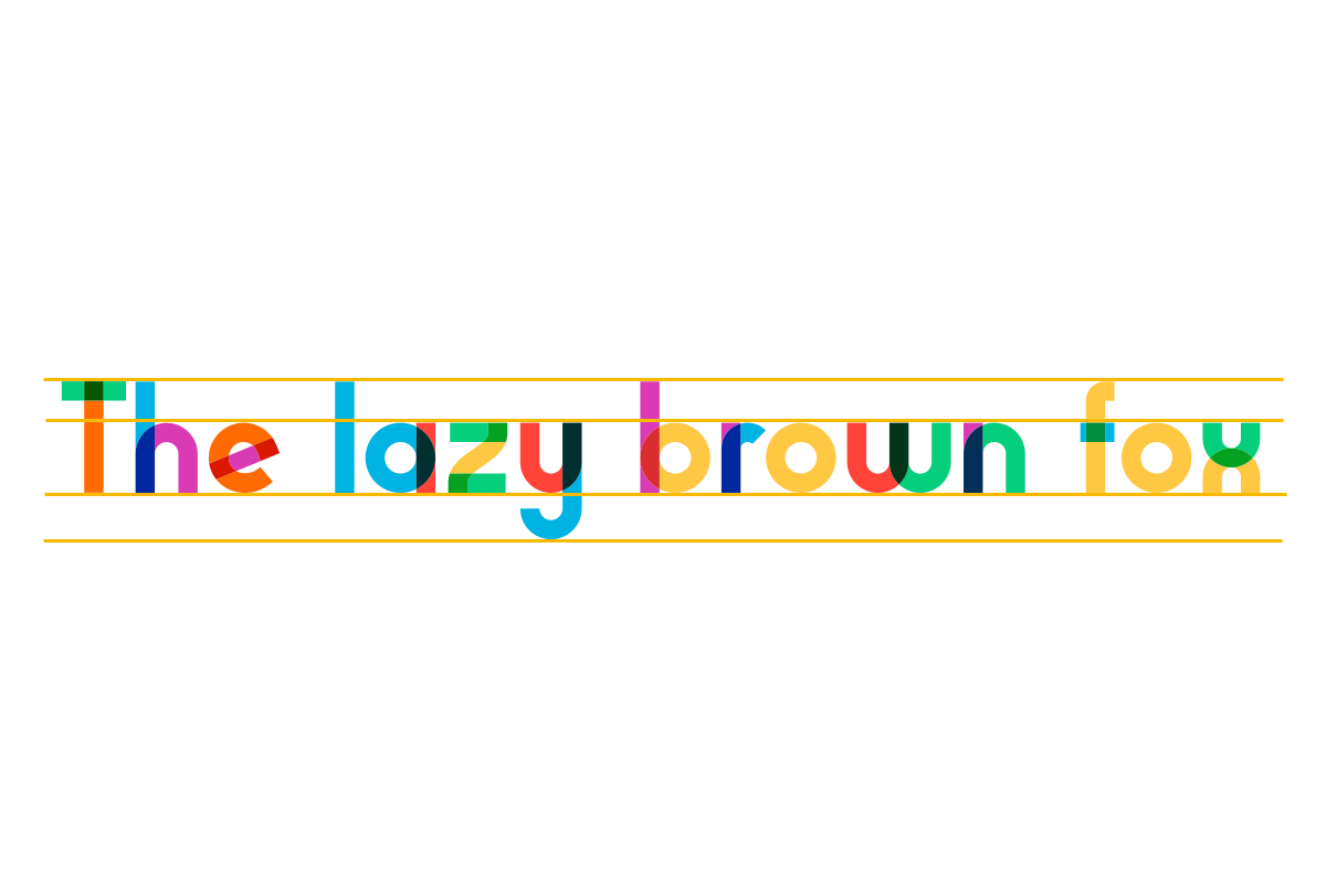
With the recent changes I’ve made to the site and in particular the goal of making the site more responsive, I’ve gone back and looked at how I display text. Until now I’ve gone by what looked good to my eye, with no real consideration for established accessibility guidelines. This led to the previous setup where I had a ‘hero container’ of 1100px with a default font size that by default would be around 16px. It’s largely been something I got away with ignoring as I wasn’t concerned about mobile experience, but as soon as that became a concern, I discovered my current font setup was not scaling well to mobile.
Turns out that best practices for prioritisation of readability is to have lines of text that are roughly 45 to 75 characters long. This is noted time and time again on the web as something to aim for, and the more I see examples of the more I agreed there may be some merit to that guideline. The layout I used previously far exceeded this and was running at lines of around 120 characters per a line. It wasn’t horrendous as the page was clean, but other sites were easier to follow. To try and get closer to this target I’ve made the following changes:
- Reduced the site hero container to 900px.
- Increased the padding between the main container and text, effectively making the text region around 800px.
These two actions decreased the amount of horizontal space for text. As I have no plans for vertical navigation, multiple columns or lots of graphics, it was necessary to drastically reduce the canvas width. So far, I think it looks fine and the extra white space frames the text well. Even with these changes lines were running long, so I additionally:
- Increased the desktop font size.
Right now, I have fonts set on desktop to the equivalent of 20px. The blog is largely just written content so having larger more present text allows that to take centre stage and makes the articles in turn very readable (in my opinion). A blog post, 4 Reasons I Use Large Type by Mike Anderson, lead me down that path and I think it has worked well for me.
After making those changes, I found that when I flipped to mobile that text was now much too large. To fix that I’ve decreased the root font size that all text scales against on mobile is 80% of what is used on desktop. I also drastically reduce the page borders on mobile.
The net result of the is that currently on desktop lines are around 80 characters while on mobile it’s around 55. I’m happy with the result.
Counterintuitively, and probably to my detriment, I haven’t settled on a font yet. Depending on whether I change that then I may be forced to experiment with the above numbers some more, although the targets will remain the same.
Something to note is that I’m also using scalable font sizes where previously these were fixed. This was important to allow people to scale text if they so desire. While above I noted 16px and 20px as the target output, this assumes a default text zoom at the browser. Actual fonts are being rendered using rem versus px, which makes the sizing relative to a base sizing to improve scalability. The text should scale gracefully for people with non-standard text settings.
Lastly, another useful tool for web development and font layout is this golden ratio tool. Recommend using this as a starting point as it helps to inform vertical spacing and other layout elements that I’ve begun to consider and also contribute to the presentation of text.