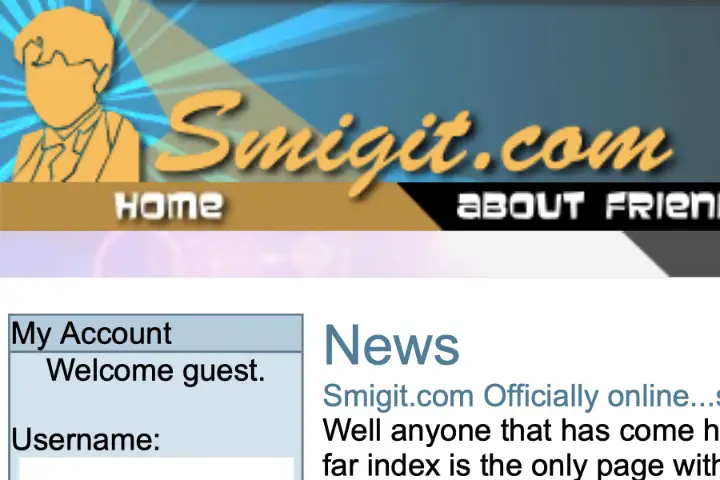
Recently my personal site passed 20 years. I’m not 100% sure on the exact date it went online, but Smigit.com looks to have gone live sometime around January 2024. Over that time I’ve had multiple iterations of the page, and in recent years have more recently changed the domain to courtenay.net after a short stint as courtenay.io.
I thought it’d be interesting to go back and look at some of the designs over the years with Archive.org’s Wayback Machine. In many cases I didn’t even recall having used certain designs. Over time the site has certainly evolved from a more journal (stream of conscious) like platform with initially a forum attached, to something I’ve used more sparingly for blogging. The shift potentially has aligned with the rise of other social media platforms that I increasingly used around 2010. By 2020 I had de-emphasised the blog aspect entirely and had just a bit of a portfolio/cv style page in a design that never fully got fleshed out, before bringing blogging back more recently.
The Internet of January 2024
Before I jump into the screenshots I’ve taken, I thought it’d be fun to note what 20 years of the internet looked like.
- In January 2004, MySpace was 5 months old. Facebook would not arrive for another 13 months as “TheFacebook”, and it wouldn’t be until September 2006 that just anyone could sign up (initially Facebook was limited to people with select college email addresses).
- Gmail would not be announced until 3 months later, on April 1 2024, as an invite only beta. It would launch with a 1GB mailbox that would spend several years expanding its capacity daily. It was not until Feb 2007 that signups without an invite were possible. Microsoft responded to the initial Gmail announcement in 2004 by itself announcing in June that it would increase their Hotmail services mailbox from 2MB to 250MB.
- YouTube would not launch until December 2015, almost two years later.
- Twitter, Instagram, Google Maps and most other common platforms did not exist.
- Internet Explorer had 80% of the browser market, with version 6.0 being around 55% of that.
- Lastly, WordPress was at the time 8 months old. It would go on to become a dominant platform online for hosting sites with reportedly around 43.1% of sites in 2024 using it. While I wouldn’t use it day one, I did move to the platform relatively early on in its life (during the 1.x period).
Initial Launch – Jan 2020
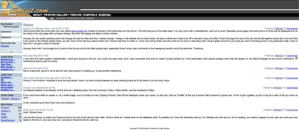
The initial design is one that I still recall due to the silhouette for the header. I recall doing that as a stencil over the top of a photo of myself, which based on the outfit and timeframe was probably a year 12 formal photo.
The initial site had a forum (phpBB) associated with it, and the blog itself was built on a blogging mod for the forum.
The year on the original post is certainly wrong and perhaps a byproduct of me updating an initial placeholder post. My guess is the site either went live on the 23rd Jan or a few days prior.
Temporary Theme – Feb 2005
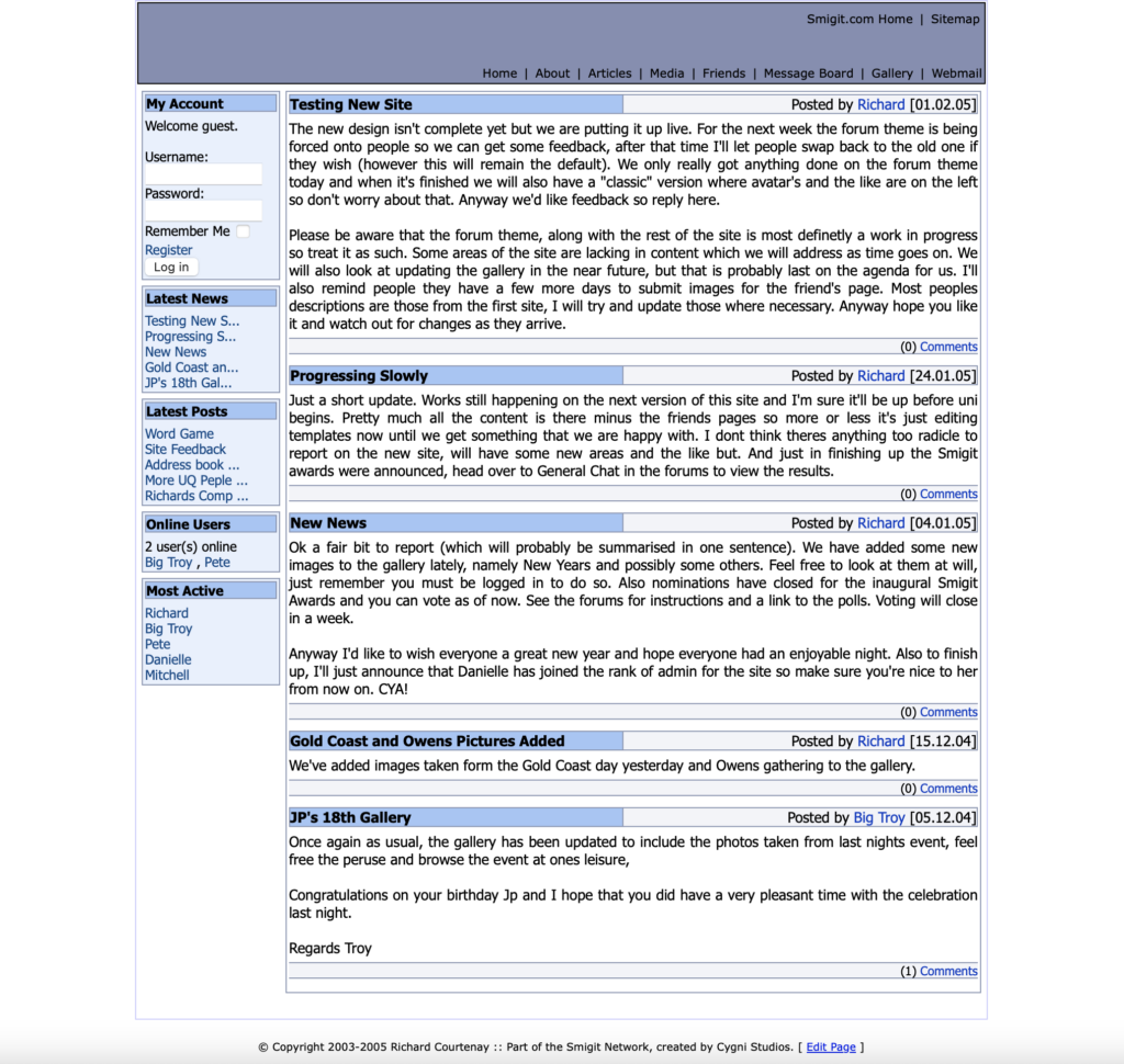
After two years I looked to update the theme. This layout was very much a temporary placeholder and was only in place for a short period. Back then, being much younger and without much of an income stream, testing changes like this would just happen on my live domain.
The layout did mark a progression away from the full screen width of the previous design to a fixed width. This was probably around the time I purchased a 24” wide screen display, which was absolutely massive at a time that most households still had 4:3 CRT’s, or if they were lucky, a 19″ to 22” widescreen LCD. This would be around the time that the Xbox 360 and PS3 would arrive and really help drive adoption of HD displays in the home.
Move to WordPress – June 2025
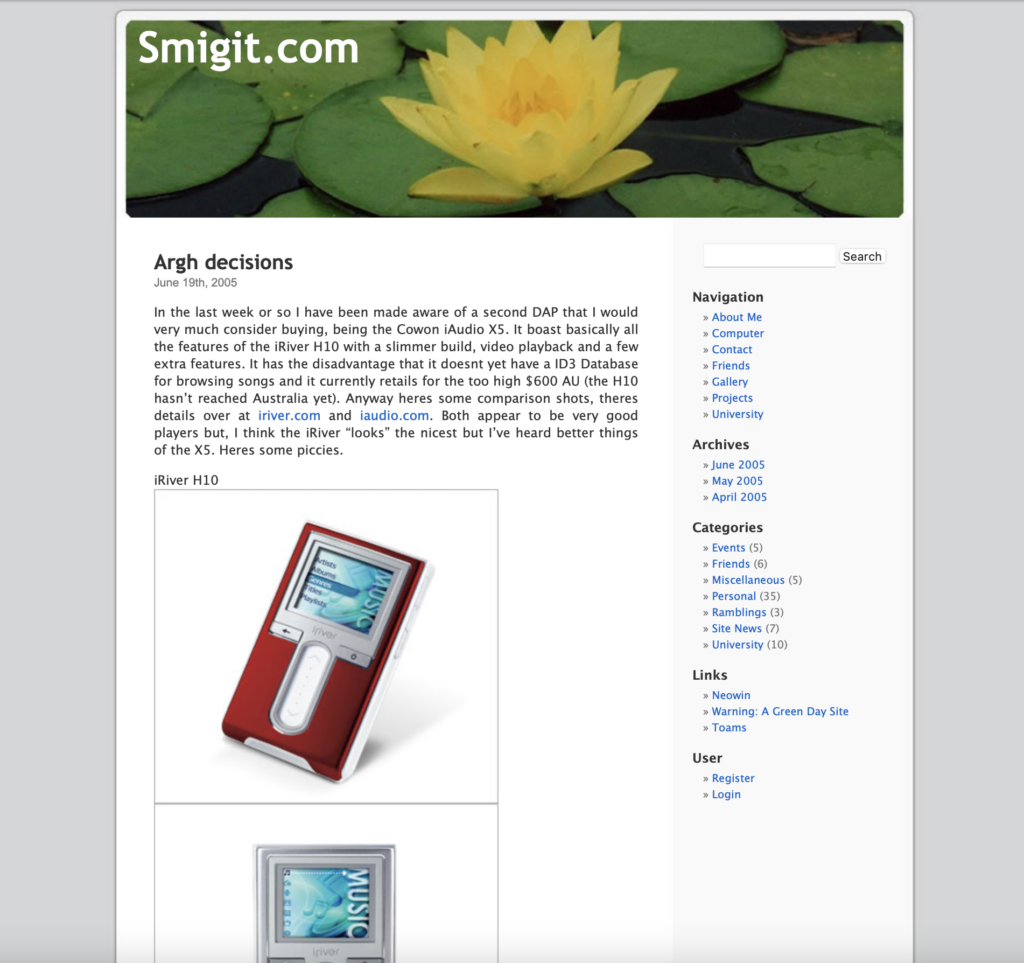
By June the above design was in effect. It was a much cleaner than previously used and notably marked a shift of the site to WordPress. In fact the theme looks to be the default WordPress theme for the time, with the header image randomly rotated through a collection of a dozen or so header graphics, which I always found to be fun.
Based on the menu options in the screenshot, it appears I had retired the forums by this time too. The previous temporary site layout still had phpBB tightly integrated.
This was very early days for WordPress as a product. It appears at the time I went live on around version 1.5.1 or so. Possibly there was a release or two prior before Archive.org took a snapshot, but it wouldn’t be far off.

Square Theme – September 2007
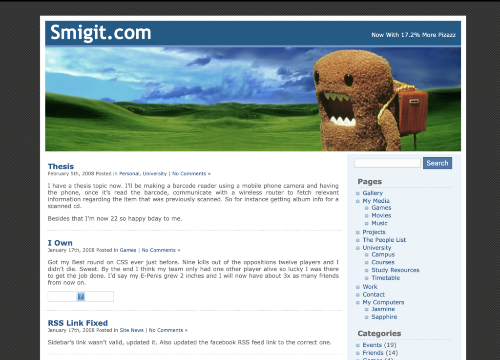
The 2007 style updated lost the curves of the previous iteration and opted for a far more boxy theme. There was also a darkening of the non-content spaces. The rotating graphics for the header image were retained with this design. I’m quite confident this update was based on a free third party theme, although I’m not immediately sure which one.
Overall I think it was a decent layout. Possibly a bit more busy feeling than the previous layout, but still functional. Otherwise there isn’t too much more to say about this one other than to note it would remain in place for almost four years, about twice as long as previous layouts.
Dark Theme – June 2011
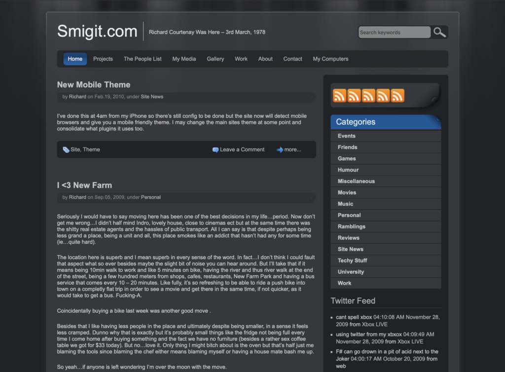
I’m going to be completely honest, I’ve been looking at this screenshot for a day and I really have no recollection of this iteration of the site. It does look very Windows Vista inspired with the black colour tone and glass like effect for the content pane.
Not only do I not especially remember this layout, looking at it now it honestly feels pretty uninspired and far too monochrome. The social media (RSS feed) space to the right suggests this layout may have not been fully fleshed out. I must have agreed at the time that this wasn’t a great direction to go, as this template was promptly replaced months later.
Bulletin Style – August 2011
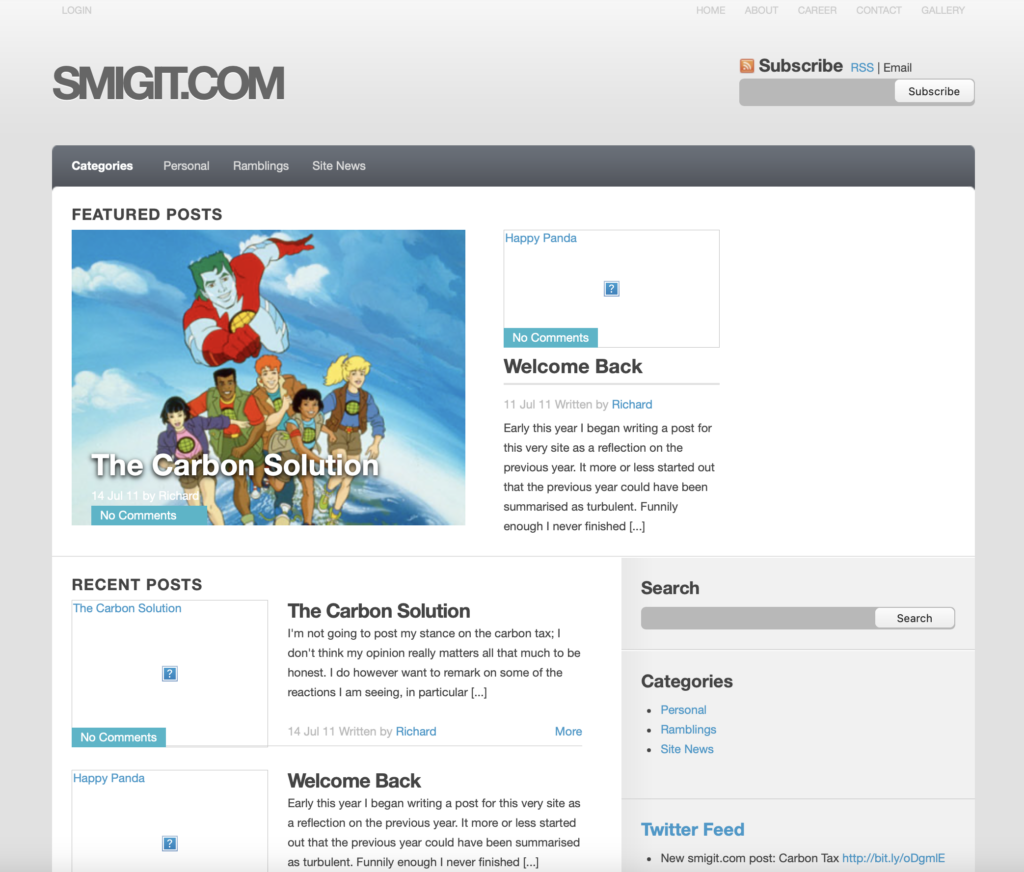
The last version of the site that would keep the original blog content was a layout that resembled more of a news sites. By now Facebook and Twitter were mainstream and any short form post that used to have ended up on my site was probably going to social media by now. The site became a space for longer form text as other options opened up for bite sized content.
For a personal blog I’m not sure this layout was hugely successful, and it is a bit dull due to the monochrome scheme, but is much better than the black theme I had experimented with before hand.
Back To Blogging Format – November 2014
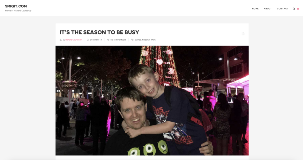
With the 2014 site design I opted to archive off all previous content and start anew. This came with a design that placed a lot of emphasis on a hero image, as visible in the screenshot. It was ultimately quite a nice design for a blog even if it increased the time needed to find or develop the images. It coincided with some trips to Europe and the like which lended itself well to this design.
Despite the nice layout, my amount of blogging over this period dropped off dramatically. This layout was in place for nearly 7 years, the longest by far, but that was more a symptom of me losing interest in blogging than it was me settling on a design for the site. Over these years I got married, purchased a house and had children. My life underwent quite a lot of change and my interest in online publishing waned.
The template for this was Blogy, a now no longer available theme, that was my first time dabbling with a commercial theme.
Courtenay.IO – December 2021
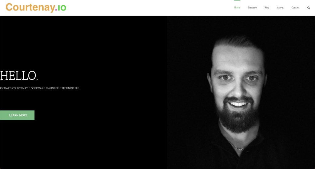
The December 2021 site design was notable for two things. Firstly I largely de-emphasised the blogging entirely which i was still not performing with any great frequency, opting for a few static pages instead. The blog was there but it sat in the background with no new content being added. Secondly I adopted my second commercial theme, Avada. Avada is the theme I use to this day, however I would later rework the site under that theme.
As a throw back to the very first page, I brought back the orange for the main logo.
With this update I tried to build a bit of a resume or portfolio site. That said the content never really grabbed me and self promotion in this manner probably isn’t something I’m massively into (you’ll barely see me on LinkedIn either). With that, this site update had some new ideas for me, but ones that were never really fleshed out into anything of interest.
Today – January 2024
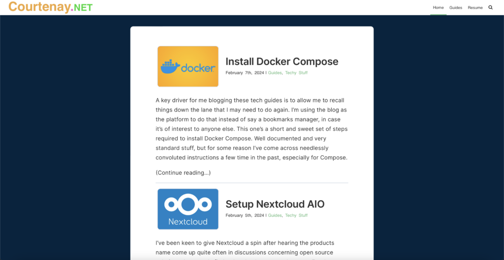
This bring us to today. This year I decided to rework the previous resume page, which I had barely maintained over the years and arguably never finished. The resume page from the previous design is still here (for now), but I have brought the blog back to the forefront by making that the front page. I have also been adding content for it for the first time in years.
I decided to get back into blogging as I had been documenting configuration for servers I was playing around with in my own tools (such as Craft). For some time I had been spending (potentially) days solving issues with IT things only to record nothing and then have to re-solve the issue later on. I decided it was time to write notes down and felt that there might be value in sharing that content. The blog also gives a better representation as to me and my interest than the previous CV style page ever could. I’m not sure if anyone does find it useful, but it has attracted some additional traffic and at the very least I find myself referring to my own articles.
I did consider whether I should change template again, but ultimately Avada has been pretty nice to work with so instead I looked at customising the layout within that them. I’ve focused heavily on optimising performance and for the first time, giving real thought to readability and responsiveness of the site including font choices and spacing. I’ve spent much more time making sure caching etc works effectively too.
Closing
Whether I’ll be adding content in six or twelve months remains to be seen. I’ve got no desire to use this platform to publicly publish every thought that goes through my head, as I did when I was much younger, so it’s not likely I’ll ever blog the sort of content I did initially. I’m generally always beavering away at something however and settling on this as a place to record that probably means the site won’t go untouched.
Ironically, this is probably the most introspective post this year, but given the twenty year milestone I thought I’d afford myself a bit of a retrospective. Not only has the 20 years been a long time in terms of what has happened online, it now represents over half my life, so it’s been interesting to go back and have a look at how this small part of myself has evolved over the years.

